
Pictures with links beneath them belong to that website
Elements of Design
Line
Used to imply direction, movement, and outline forms/shapes.


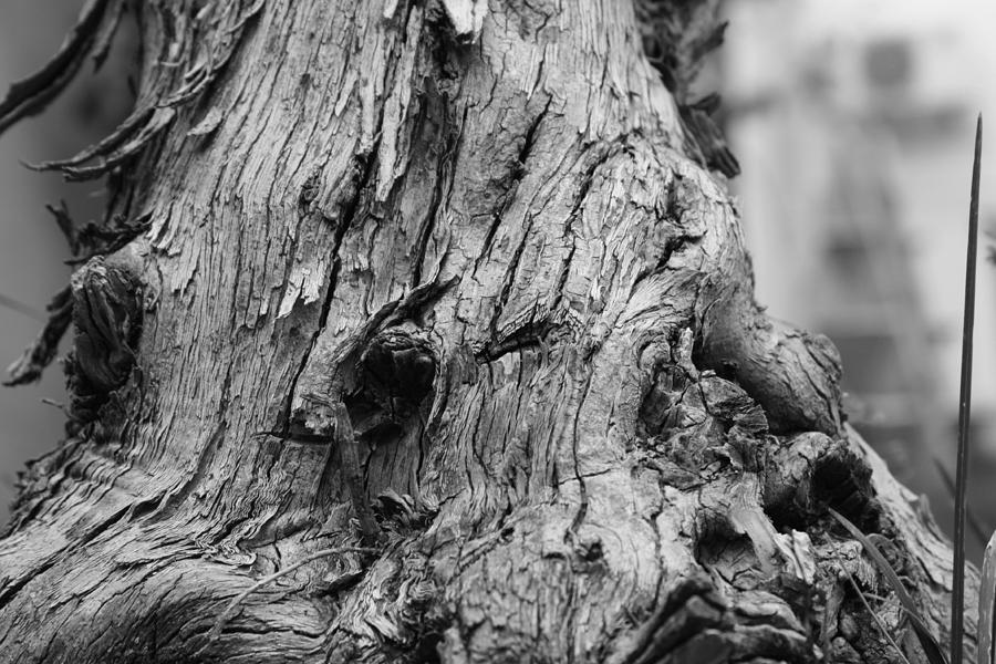
Describes/shows the texture/feeling of an objects

http://images.fineartamerica.com/images-medium-large/natural-texture-angel-jesus-de-la-fuente.jpg
Shape
A enclosed two dimensional area


Form
When a 2-D objects becomes 3 dimensional. The use of tone/shadow is included to give an object the 3-D appearance when on a flat surface.


When a specific colored spectrum is seen due to light. Color can be shown by a color wheel and has different tones/intensities. Color can be described as: bright, pastel, warm, cool, in harmony, or discordant.

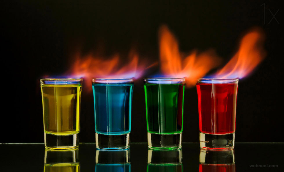
http://webneel.com/daily/sites/default/files/images/daily/07-2013/5-vivid-color-colorful-photography.jpg
Tone/Value
Refers to the darkness/lightness of a color. Tone can be described as: dark/dull, gloomy/stark, strong, or weak.
.jpg)

The amount of brightness in a color. It can be described as:bright/radiant, strong, vivid, or weak/dull


http://i.dailymail.co.uk/i/pix/2014/09/24/1411579788946_wps_169_Pictures_by_Pal_Jakobsen_.jpg
Principles of Design
Pattern
Involves the repetition of an objects/shape/design, witch creates rhythm. Patterns can be created in a organized way or randomly.


Uses multiple elements to create the impression of movement.
Movement may be represented through action
and
abstract, non-representational marks


http://www.olgamoroz.com/wp-content/uploads/2012/08/Slow_Shutter_Night_Time_Photo_The_Ex-1.jpg
Unity
Unity
When the qualities of the whole image works together to form a sense of completeness/harmony and order. Lack of unity can be used to create disorder, incompleteness, and disharmony.


When a object/certain part of a picture draws the attention of viewer.

Balance
Uses various elements and creates a sense of order. Order can be achieved by formal or informal, symmetrical or asymmetrical, and rigid or random. Imbalance can create a sense of awkwardness/discomfort/exciting visual response.


Contrast
Uses opposition and juxtapositions qualities that are opposite of one another. High contrast can be used to emphasize, dramatize, add variety, and surprise. Low contrast can create a soothing/harmonized/comforting image.


No comments:
Post a Comment